CheckBook Does Multiple Accounts Files

“How can I manage more than one Accounts file with CheckBook or CheckBook Pro?”

We get that in our inbox from time to time.

What these users are looking for is a system that relies on documents they can open from the Finder, just like with Pages or Numbers, so they can choose the document with the set of Accounts they’d like to work on.  It’s the Mac-like way of managing complicated data.

When we created CheckBook we had it hide its data file deep inside the user’s home Library folder because most users wouldn’t need more than one, anyway.  We were aiming pretty low, after all, at the user who didn’t need more than a very basic check register.  For that kind of user it’s simpler to store the data out of sight, then, so it can never be accidentally modified by another app – or removed(!).  This is identical to the way Apple does it for apps like Address Book, by the way.  So we never adopted a document-based approach to handling the Accounts file, because the user would never interact with the file except to backup or restore it.  There was a major plus for us, too – we got to skip the “extra” that goes into telling the Mac how to deal with a particular type of document.  Win-win.

Over the years, as users here and there asked us for the ability to manage multiple files, we’ve realized what we’ve got is a win for most of our users, a win for us, but not a win for a growing segment of users.  We wanted the app to be flexible enough for everyone – but still needed it to be a no-brainer for the majority.  As Macs became affordable more users wanted the ability to share their Accounts with family on different Macs.  Online storage matured, and users wanted to store the Accounts file where services like DropBox could see them.  And then, Mac OS X Lion came and hid the Library folder.

We were already working pretty hard on CheckBook 2.5 (and we’re back at it!), figuring out all the little details of synchronizing Account data between Macs.  We knew we could make things a lot easier for the users who wanted to think outside the box if we just switched over to a document-based approach.  The problem was, we didn’t have a lot of time to think about chucking the whole system – and definitely no time to actually do it.  CheckBook’s a bit like a spoiled brat – we didn’t raise it to put its toys away at night.  In other words, it doesn’t know how to think of its data as a document, so the code leaves little messes all over the place.  CheckBook is a fairly complicated little kid.  Teaching it how to clean up after itself wouldn’t be an overnighter.  So, we came up with a pretty simple plan to make things easier without taking a week:  Let the user decide where to store their Accounts file and leave it at that.  So we added that to CheckBook 2.2 and gained a system where the user could…

  • Store the Accounts file anywhere
  • Share the Accounts file by placing it in a shared location (one copy of CheckBook at a time, though – more than that and you’ll see data loss)
  • Store the Accounts file where DropBox and other services can see it
  • Have multiple Accounts files

And that last little bit answers the original question.  Sure, you can you have multiple Accounts files.  It’s just not obvious.

When you change the Accounts file location the file at the current location is left where it is.  Better than that, the current data is saved to the current location, just before the location is changed.  So now you can change the location between two folders containing separate Accounts files and manage two different sets of data.  It’s an extra click or two to go into Preferences->Advanced vs. double-clicking an icon in the Finder, but it works fine.

Going forward, we’ll completely adopt the document-based approach.  When that comes, the first time you launch CheckBook it will ask where to keep the Accounts file and create a real document file there.  If the user wants, they can then create any number of new documents and store them wherever they like.  Launch CheckBook and it will always try to open the last Accounts file you used.  We’ve had this in mind for a very long time but, like I said, much has to change first.  But that’s our course, folks.  We’ll get there!

In CheckBook, Development, General | Leave a comment

4 Ways Apple Can Improve Customer Experience on the Mac App Store

[Excellent news:  The Loop reports Apple will not only allow developers to respond to reviews, they’re also rolling out an API that brings in-app rating and review to every user’s fingertips while preventing developer abuse. It’s not quite what we asked for over five years ago as tech support issues – which can start off a bit hostile – will still face the public before developers have a chance to respond and they’ll remain visible, coloring an application’s story without any accountability, unless users remember to remove them.  That’s OK.  This is a great and much-needed move in a direction that helps users, developers, and Apple.  Win-win-win!Thank you for finally taking this part of application development and deployment on the App Store seriously, Apple!]

We’ve been connecting with new users through the Mac App Store since its opening last January.  It’s an exciting (and challenging) channel for us with a lot of potential.  Lately, we’ve been wondering how to turn it into a hub for positive, lasting relationships between users, their developers, and Apple.  Here are 4 changes Apple could start working on today to make the Mac App Store a better experience both before and after purchasing your apps.

1. Foster Healthy Dialogue Between Users and Their Developers

Like effective user interface design, which clearly communicates its purpose without forcing the user to open a manual, effective customer service begins long before the customer actually asks for help.  A simple Frequently Asked Questions web page, for example, can answer a question in a few minutes without the hassle of an email or a phone call.  This kind of resource also works great during evenings and weekends, when support resources are tight or non-existent.

Getting to a developer’s support resources from The Mac App Store can be challenging for some users.  It gives users a link to their developers support webpages but there are two issues -  the links are positioned on the far right side of the page, near the top, and they’re in very low-contrast light grey on a light grey background.  To see what I mean, click on the following image and try to find the support link:
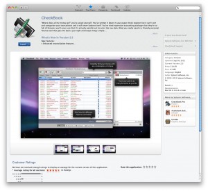
CheckBook at the Mac App Store - Can you see the support link?

CheckBook at the Mac App Store – Can you see the support link?

How long did it take you?  The support link isn’t part of the dominant top to bottom flow of content on the left side of the page, nor is it inside the two information boxes that stand out clearly along the right side of the page.  The developer website and support links are in a “blind spot”, outside where the user’s eyes are most likely to fall and, because of the light grey on light grey, they’re not eye-catching even if the user looks in that direction.  Apple can easily remedy this by moving both links to the “Information” box on the right side of the page and displaying them in the same high-contrast black on light grey background.

But say a user has exhausted their developer’s support resources.  What’s next?  Most send an email or call their developer directly – but by that point some users are very frustrated because they either don’t know how to contact the developer or because they think the developer can’t be contacted directly.  Their issues are very important and they don’t know where to turn.  That’s when they head straight to the bottom of the product page to write a negative review.  It’s a tech support cry for help but Mac App Store reviews are not the proper forum for tech support.  That’s because developers have no way to respond to a review.  While the user writes out their tech support issue Apple does take a half-step to make sure the user stays on point, asking “If you need support, please visit …” with a link to the developer’s support webpage at the far right of the review box.  This doesn’t go far enough.  The user is frustrated.  They’re not likely to see questions and links in small print off to the right side of the page.  They’re ready to talk NOW.  How can we help them?

We can’t today, but with a few changes we can turn this into an opportunity to support the user.  The question, “If you need support, please visit …” could be asked in a modal format, giving the user a moment to pause.  The user might realize this is a black and white situation – if you need support, visit the developer, if you want to write a review, proceed.  This won’t catch every tech support issue, though, because the user can still proceed and write what they want.  That’s their right and it should not be taken away (within Apple’s discretion).  But that leads to two other suggestions.

Knowing the user may press on and write up a tech support issue in a negative review, why not quarantine negative reviews (reviews of less than 3 stars) for, say, 24 hours before letting them go live on the Mac App Store?  Explain to the user their negative review will be quarantined if they proceed.  Halfway through the quarantine period send them an email explaining the review will go live if they do nothing but it can still be rescinded.  That way, if the review is actually a tech support issue, the user has time to find an answer and they might even pull the review before it goes live.  If not, then the quarantine runs its course and the review goes live.  So what if the review is a tech support issue and the user doesn’t find an answer?  Can we still help the user?

Today, the Mac App Store does not provide developers with contact information for each sale.  It also does not provide developers with a means to respond to reviewers.  What developers need, at the very least, is a reliable communication channel with every reviewer, positive or negative.  It’s fine if Apple feels contact information should be kept private, but what about letting developers communicate with their reviewers through anonymous email, like Craigslist, or through a private messaging system built into the Mac App Store itself?  If Apple is concerned about spam or other abusive behavior from developers a single complaint could easily be tracked to the offending message.  For things like harsh wording, which are subjective, three strikes and you lose your communication privileges, temporarily or even permanently.  But be flexible, Apple.  Get real people talking it out on the phone, if necessary, before you take serious action.  A blanket policy with a cold form email backing it up and no appeals process?  Poor form.  You can go right ahead with a zero-tolerance policy for spam, though.

2. Let Users Try Their Apps Before They Purchase

“Try before you buy” is a gospel often heard at the corner of “I don’t know how it works” Street and “It costs a lot” Avenue.  When a product’s price is outside our comfort zone and we’re not sure it can do what it says on the tin, we usually have a hard time signing on the bottom line.  Take cars.  They cost so much some of us have to take out a 6-year loan and scrape the cash together month-to-month.  And, to most people, what’s under the hood of a car is more or less magic.  The specs on the sticker are like reading a foreign language upside down.  All you know is you put in gas, change the oil every so often (right?) and it just works.  So you don’t buy a car without a test drive  – which seals the deal (or blows it).  Works for cars…and also works for software.  Users don’t know what they’re going to get when they purchase an app and they’re not comfortable paying more than, say, $5 to find out.  When they take a leap of faith based on flashy screenshots or a great app description, then get burned, most users are very likely to demand a refund and think poorly of the app and its developer.  Users need to try before they buy.

And it turns out try before you buy is a relatively easy thing to implement on Apple’s end.  Just encrypt a trial mode flag in the receipt file for each app.  Developers could check for the flag to find out whether to run in trial mode.  And to make this easy on the user, keep them in the loop with a consistent user interface:  each time an app is launched, Apple could display a Mac App Store dialog to tell the user they’re in trial mode, with buttons to continue, purchase or uninstall.  A finer point:  Many users are foggy on whether the data they enter in a trial app will still be around when they purchase a real license.  The Mac App Store could reassure them up front at the time of purchase.

(Apple seems to prefer developers adopt in-app purchase to get trial mode functionality – but that’s just not the best strategy with Lodsys, the patent-holder for Apple’s in-app purchase technology, throwing lawsuits at developers – even Mac app developers – for using it without their official blessing.)

3. Let Developers Initiate Returns on Behalf of Their Users

When users decide to throw in the towel on a product they need a clear path to receive a refund.  Problem is, there’s no “Refund” button in the Mac App Store application, just a link to the Mac App Store support webpage at apple.com.  Guess what?  There’s no “Refund” button on that page, either.  And then?  Well, there’s no “Refund” button on any of the pages you can reach directly from the main support page.  It’s so confusing and frustrating that users often turn to their developers for a refund – but the developer can’t help because only Apple can approve and initiate a return.  Apple could take the lead here again and empower developers to initiate refunds for their users.  If the developer is OK with losing the sale, why not?  The user’s needs are met sooner, with less hassle and more respect for their time, and Apple gets to keep their 30% anyway, even on refunds.

4. Give Developers a Human Point of Contact at Apple

The Mac App Store costs developers a cool 30% of gross revenue.  Put that in perspective:  eSellerate and FastSpring charge just 8.9% or less, and among the perks for paying less developers get a live human account manager to speak with during regular business hours.  And it’s not even that expensive.  In the 8 years we’ve been with eSellerate we’ve gotten on the phone with our account manager 5 or 6 times – and 2 of those times they called us to say hi and straight talk about our concerns or suggestions.  Total time on the phone:  roughly 3 hours.  Over 8 years.  Apple has an additional 21.1% (or more) in revenue to work with here and right now all we get is a complicated email form.  When we have a question about the Mac App Store we need a human point of contact to either answer our question or give us a gentle push toward the right resources.

Apple could even take the lead here and give their developers a 24/7 emergency contact.  Let me tell you, when you have a customer-facing situation on the Mac App Store on a Friday night it’s a looooooong 60 hours until Monday morning.  We recently had this get in the way of properly caring for our users (see http://www.splasmata.com/?p=1486 and http://www.splasmata.com/?p=1571 for technical details).  Initial reports came in over a weekend.  We watched negative reviews pile up for our products at the Mac App Store for two days before we could get anyone’s attention at Apple through their email form.  That’s poor service for our users and a lot of angst on our end that wouldn’t happen if we had an emergency contact at Apple.  This is a golden leadership opportunity for Apple -provide an example of good customer service to developers and those same developers will follow Apple’s lead, creating healthy, sustainable customer service relationships with their users.

What Now?

Apple can start today with subtle tweaks in the Mac App Store’s layout, gradually improving the review process using our other ideas as a starting point to open a healthy communication channel between users and their developers.  Likewise, Apple can take the relatively painless step of adding a trial mode flag to the Mac App Store receipt file today, gradually improving the user interface side so trial mode is consistent and easy to understand.  Letting developers get the ball rolling on refunds instead of bouncing users between webpages and/or between the developer and Apple would tell the user their time is valuable – and where we come from that’s just good manners.  Finally, Apple has a great opportunity to open up communication between the Mac App Store staff and developers, making it easier to serve the user and laying the foundation for professional relationships built to last.

Thanks for reading – please comment on this one if you get a chance!

In General, Opinion | Leave a comment

You want fries with that Text Export?

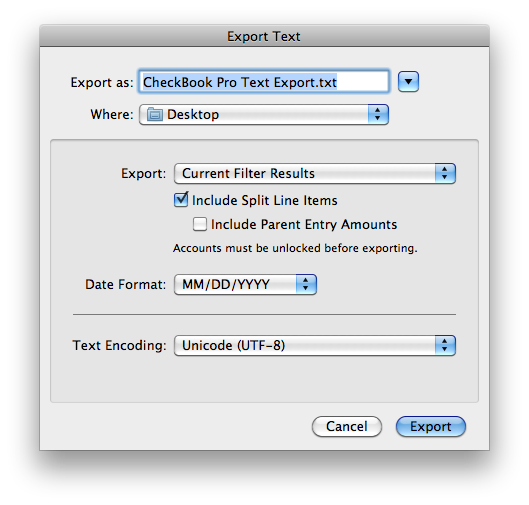
CheckBook Pro 2.2 came with new features for interacting with Split Line Items, and we even include them when exporting to Text. We faced a tough question when we did this, though:  How do we handle Parent Entry Amounts and Split Line Item Amounts in a file that may be viewed in a spreadsheet?  What if the user wants to SUM or throw some other math on the Amount column?  SUMming the Parent Entry Amounts should equal the total of the export.  SUMming the Split Line Item Amounts should equal the same (unless there’s a QuickFilter or Smart Folder in there somewhere).  SUMming both, then, would potentially equal up to twice the total of the export (not every Entry is a Split, and a Starting Balance could affect things, too).


We figured we’d throw out Parent Entry Amounts for Split Entries.  If the user wanted to view things in a spreadsheet they would realize that the Amount column had to equal the total of the export.  If they wanted the actual Parent Entry Amounts they could easily add functions to any empty Amount cells.  Because everyone who exports to Text is a closet spreadsheet jockey, right?


Eh, not really.  Now that 2.2 and 2.3 have been out for a while we’ve gotten some good feedback from some users that they just want to look at the numbers in a spreadsheet, without SUMming or other analysis.  Like a report.  So our one size doesn’t fit all in this case.  Back to the drawing board for a little rework…


Here’s what we’ve got:


CheckBook Pro 2.5's new Text Export options

CheckBook Pro 2.5's new Text Export options


Want Split Line Items?  If so, what about those Parent Entry Amounts?  Now you get to decide!  The changes are in the upcoming CheckBook & CheckBook Pro 2.5, but we backported to a pre-release build of 2.3.1 just in case anyone needs these options now.  Drop us a line at support@splasm.com if you’d like the latest build!


In Development | Leave a comment

The Mac App Store Says CheckBook or CheckBook Pro is Damaged. It’s OK – Your Data is Safe.

Sometimes, the Mac App Store on Lion can fail to properly update an app. When it fails, the app’s receipt is also lost and the next time you launch the app you see an error that it’s “damaged” and must be downloaded again.

The error looks like this:


When you launch CheckBook or CheckBook Pro and see this error you may think your data is hosed. That’s understandable but it’s OK – your data is fine.  Your data is stored in a different location than the app so throwing out the app can’t affect your data. You may also think you must purchase the app a second time. Don’t worry – you do not have to purchase again. Just move the app to the Trash, go into the Mac App Store, click the Purchases button at the top of the window and install a fresh copy of the app. The next time you launch the app your data will be there, ready to pick up where you left off.

We’ve received several reports of this error, but they only add up to about 1% of our Mac App Store sales. Sadly, about 1 in 4 reports come in as negative reviews at the Mac App Store, heavily criticizing our apps and warning potential users to stay away. Mac App Store reviews are not for technical support.  We don’t get any user info from our Mac App Store sales and we don’t get any user info for our reviews.  That makes it impossible for us to communicate with our reviewers.  Posting a technical support issue in a Mac App Store review can’t lead to a resolution.

Apple has acknowledged that, in CheckBook and CheckBook Pro’s case, failed updates on the Mac App Store are the result of their bug and they plan to release a fix soon (check out http://splasmata.com/?p=1486, in which we give kudos to Apple). For reference, our bug report was filed under Apple Bug Reporter ID #9906657, which Apple closed as a duplicate of #9702796.  If you have any questions please get in touch with us at support@splasm.com.

Do you love CheckBook or CheckBook Pro? How about friends or followers who use Macs? Please consider sharing this info through Facebook, Google+ or Twitter. Thank you!


In General | Leave a comment

CheckBook Pro’s Hidden Powers

Last week, MacNN compared CheckBook Pro to iBank, rating both 4 out of 5 stars. Reading the review you’d think that, compared to iBank, CheckBook Pro is a bit like a knife at a gunfight – but here’s the key question: Is CheckBook Pro the better knife? The review didn’t say, but in the spirit of upholding the honor of all our products, I’m here to tell you, by golly, CheckBook Pro is better if what you’re looking for is a darn good knife.

First, I think we should take a look at the humble, understated nature of CheckBook Pro. Everyone has that one friend who, though extremely talented, doesn’t toot their own horn, spouting off about their accomplishments and abilities. Rather, they’re the intelligent soul who quietly tucks the A+ beneath a text book before their classmates can see it, the athlete who blushes as they approach the podium to accept a medal.

CheckBook Pro is kinda like that friend, hiding more advanced features so you won’t feel intimidated. Its sleek, user-friendly interface is crafted so that, no matter what level you’re at, you can just get started with the business of managing your personal finances. Later, as you get more comfortable with the app, you’ll uncover options that would have overwhelmed you at the outset.

MacNN’s review compared CheckBook Pro to iBank to see which would make an ideal replacement for Quicken. By now, everyone knows poor old Quicken 2007 flat-out doesn’t work with Lion. In the weeks after Lion came out, though, Quicken users began frolicking with the new king of the jungle only to find out later that their personal finance manager was completely useless. Not only that, after installing Lion these poor souls learned they couldn’t even export their data so they could migrate to another app. Good on MacNN, a trusted Mac news outlet, for taking the time to help these Quicken refugees find alternatives.

While working with iBank, the reviewer stated, “I found the interface easy to work with, once I figured out the hide and show options.” That makes CheckBook Pro’s approach look all the better, don’t you think? Rather than a busy array of options you rarely need and have to figure out how to hide, CheckBook Pro gives you a clean, easy to use interface that focuses on the current task, with advanced features never more than a click or two away.

Now, since CheckBook Pro is not in the habit of bragging, I’ve got my work cut out for me. Let’s begin with CheckBook Pro’s resumé:

• Everything in CheckBook, its powerfully simple little brother
• Smart Folders to help you search using any combination of criteria
• Folders so you can group or archive your Entries any way you want
• Global Account Summaries to report on all your Accounts
• Global Scheduled Entries Reminder so you can manage all your pending Scheduled Entries at once
• Multiple Entry Change to help you quickly change the details for the current selection

Like CheckBook, CheckBook Pro presents the basics of personal finance management with very little to get in your way. Open the app and you’re returned to the last account you used, looking right at the user interface for what you’ll spend most of your time doing – managing your transactions. When it’s time to reconcile or schedule a transaction or look at a summary of your cash flow those tasks are a single click away instead of distracting you from the task at hand. That’s what we mean when we say CheckBook Pro is “simply powerful” – it gives you the power you need, but keeps it simple so you can get on with managing your finances.

Smart Folders, Folders, Global Account Summaries and Scheduled Entries, they’re all powerful tools but let’s focus on the first two. With Smart Folders it’s easy to save any combination of filter criteria so you can find transactions later. Pretty handy if you want to see all transactions where you bought groceries over the past month or you need a list of tax-deductible transactions for last quarter. Like the MacNN review points out, Smart Folders lack ANY and OR logic (touché), but those enhancements are planned and will come in time. The review didn’t mention Folders at all. They’re a great way to archive everything from last year, or group related transactions, like all the checks you write for your kid’s band uniforms.

Our reviewer was hit pretty hard by iBank’s inability to properly import QIF. Multiple Entry Change could have made all the difference there – if it was an iBank feature, that is. Select a group of transactions in CheckBook Pro and press the Change button at the top of the window and you’re changing the dates, amounts, categories, etc. and etc. for your entire selection instead of one transaction at a time.

Among other talents that didn’t impress our reviewer, CheckBook Pro gives users just one type of report: the Account Summary. Account Summaries look simple, but users can customize them to report on several types of transactions, such as Debits vs. Deposits or Tax-Deductible vs. Taxable transactions. The review notes that Account Summaries subtotal by month, but that’s just the default – they can also be set to subtotal per day, week, quarter, or year. Take it even further by turning on or off subtotals by Description, To/From, Type or Category. That’s a lot of power, but you won’t see those options unless you press the Change button at the top of the Summary section. Why is that? Because when it’s time to look over reports you want to focus on the actual data, not a window full of buttons. Here’s a bonus tip: select a Smart Folder or Folder and its results feed right into the selected Account Summary – so you can be pretty specific about which transactions to report on.

Another interesting item the review touched on: CheckBook Pro’s Split Line Items interface. At first glance, they can be added only by clicking the Add Split Line Item button. When you’re actually using them, though, you’ll find you can tab through the last Split Line Item and a new item will be added automatically. It’s the same if you double-click an empty part of the Split Line Items list – a new item will be added. Bonus tip #2: double-click part of a Split Line Item from the main Entry or Reconcile register to go straight to editing the same row and field in the Split Line Item.

There’s a lot more to it but, what I’m really saying is, CheckBook Pro doesn’t make a big deal about how powerful it is because you’ll find out soon enough when you actually use the app. That’s something reviewers don’t always have time to do.  Can CheckBook Pro replace Quicken?  The best way to decide is to download the free trial, import your data and give it a spin. You wouldn’t buy a car without a test drive.  Why purchase something as important as a money manager without trying it first? If you have any questions or comments, shoot us an email at support@splasm.com and let’s talk. Unlike your stereotypical car salesman, we really want you to end up with the best personal finance manager for your needs – whether or not that turns out to be CheckBook Pro!


In General | Leave a comment

Kudos, Apple!

Several weeks ago Apple’s mighty new cat, OS X Lion, gave millions of Mac users a good reason to finally get on the Mac App Store.  Add to that another “finally” – we had just released CheckBook and CheckBook Pro on the Mac App Store, after we let their rejection in January push us to focus on a major future release instead of fixing the things Apple didn’t like.  With Lion came a few user interface glitches in CheckBook, so updates were in order.  We rolled out CheckBook and CheckBook Pro 2.2.1.


Three negative reviews very quickly gave us a wake-up call.


All three were the same complaint:  after updating, our apps weren’t launching properly, stating they were “damaged” and should be reinstalled.  And all of the reviews expressed the same underlying fear:  our users were very, very concerned that reinstalling the app would cost them their data.  Curiously, none of them had asked us directly for help.


On the subject of data loss, never fear.  Replacing the app really is as simple as it sounds – CheckBook and CheckBook Pro keep the user’s data in a separate location, never in the application itself, so drag the app to the Trash and reinstall away.  Totally understandable, though, that our users would be concerned.  Too bad the Mac App Store doesn’t provide a way to say as much directly – it’s impossible for developers to communicate with their users through the Mac App Store, in public or in private, come hell or high water, negative reviews or glowing praise.  So, the negative reviews took center stage, our users panicked, sales dropped.  Pretty exciting watching all that from the sidelines.


Fortunately, developers have other channels for this sort of nightmare, just waiting to be discovered when a spare block of several hours presents itself.


We started by buying our own applications (hey, 70% off!) so we could post reviews telling our users it’s OK, no need to panic, just replace the app and you’re set.  But that plan failed les misérably – the reviews never made it through Apple’s careful moderation.  No reason given, they simply never appeared on the Mac App Store.  Foiled but not defeated, we put Plan B into effect – changing the description of each app into a temporary tech support statement.  The tide of negative reviews was stemmed, and one user even amended their review in our favor.  The other two did not.  Lucky for us, their reviews contained factual inaccuracies, something Apple, mercifully, won’t abide.  Both reviews were zorched.


But the original problem was still there:  Something was going horribly wrong, preventing our updated apps from launching properly and scaring the bejeebs out of our users.  Several more reports came in from users who found our support link (at the right side of the product page on the Mac App Store – somewhere between blind spot and low contrast, as far as page placement goes).  We started gathering details.  Shockingly, the issue came down to two very important points:  These users were all on Lion, and (this is the shocker) their apps were missing their _MASReceipt folder, where the Mac App Store puts a receipt file so apps can double-check to be sure they’re all properly purchased and stuff.


It didn’t figure that anything would actually zap the _MASReceipt folder, but seeing it was definitely missing we made sure it wasn’t our code, then took a trip to bugreport.apple.com.  It took some time but, eventually, we got a phone call from Jean-Pierre at Apple.  We went over all the details, all the possible issues we could think of, the works.  Jean-Pierre was at a loss.  No other developer had reported the issue, either.  Perplexed, we planned to try to capture more details from the next afflicted user and Jean-Pierre agreed to research with a couple of groups at Apple.


Less than half an hour later Jean-Pierre was on the phone, giving us the good news:  It’s a bug in the way Lion handles delta updates from the Mac App Store.  The delta update is applied, a new receipt is installed.  That part works – really well, too, or Apple would know about it.  The problem is when it doesn’t.  In that case, a full update is installed and…the new receipt gets lost in there somewhere.  Already fixed, he said.  Planned for a future update.  Hallelujah and rejoicing on our end of the phone.  I may have danced a jig, even.


But why just us?  Were our apps the only ones with failing delta updates?  Maybe.  I had asked Jean-Pierre to search the Mac App Store reviews for the word “damaged” to see if anyone else had reported something similar.  I hope he follows through.  It would be great for the affected developers to get word a fix is coming.  Shooting an email to the affected users would just be good manners.  As for us…well, one idea we kicked around is that Apple’s system for automatically generating a delta update may not be aware of file resource forks, leading to a failed checksum after the update is applied.  CheckBook and CheckBook Pro have a ton of images and we could’ve tweaked a resource fork here or there to get rid of custom icons.  But really, who knows?  We’re just pleased as punch that Apple listened, found the issue and let us know a fix is in the works.  Kudos, Apple!


In General | Leave a comment